The Mercator Map: Unpacking Its Enduring Legacy And Limitations
The world, as we often see it on flat maps, is largely shaped by one man's ingenious solution to a complex problem: how to represent a spherical Earth on a two-dimensional surface. This challenge led to the creation of the Mercator Map, more formally known as the Mercator Projection. Developed by the Flemish geographer and cartographer Gerardus Mercator in 1569, this projection revolutionized navigation and became the standard for sea charts for centuries, fundamentally altering how explorers and sailors perceived their journeys across vast oceans.
Yet, for all its revolutionary utility, the Mercator Projection is also widely recognized for its inherent distortions, particularly in representing landmass sizes at higher latitudes. While invaluable for its intended purpose of navigation, its widespread adoption has also influenced our global perspective, often leading to misconceptions about the true scale and relationships of continents and countries. Understanding the Mercator Map means appreciating both its historical brilliance and its persistent cartographic controversies, delving into how a single projection could be both a beacon of progress and a source of enduring visual bias.
Table of Contents
- Gerardus Mercator: The Visionary Behind the Projection
- What Exactly is the Mercator Projection?
- The Revolutionary Purpose: Navigation at Sea
- How the Mercator Projection Works: A Visual Explanation
- The Advantages That Shaped Global Exploration
- The Inherent Distortions: A Cartographic Controversy
- The Mercator Map in the Modern Era: Beyond Navigation
- Beyond the Horizon: The Future of Mapping and Perception
Gerardus Mercator: The Visionary Behind the Projection
To truly appreciate the Mercator Map, one must first understand the mind behind its creation. Gerardus Mercator, born Gerhard Kremer in Rupelmonde, Flanders (modern-day Belgium), in 1512, was far more than just a mapmaker. He was a polymath of the Renaissance era, excelling in mathematics, astronomy, calligraphy, and engraving. His intellectual curiosity and meticulous approach to his craft laid the groundwork for a cartographic revolution.
A Glimpse into Mercator's Life
Mercator's early life was marked by rigorous education. He studied at the University of Leuven, where he delved into philosophy, theology, and mathematics. It was here that his passion for geography and cartography began to blossom. He started his career as an instrument maker and engraver, producing globes and astronomical rings. His early works showcased an exceptional level of detail and accuracy, quickly earning him a reputation among scholars and navigators. However, it was his groundbreaking work in map projection that would etch his name into history.
In an era of burgeoning global exploration, accurate navigation was paramount. Existing maps were often crude, making long-distance sea voyages fraught with peril and uncertainty. Mercator recognized the critical need for a map that could accurately represent compass bearings, allowing sailors to plot a straight course across the curved surface of the Earth. This fundamental challenge spurred him to develop what would become his most famous contribution: the Mercator Projection, first unveiled in 1569 on a large world map measuring an impressive 202 centimeters in length. This map, titled "Nova et Aucta Orbis Terrae Descriptio ad Usum Navigantium Emendate Accommodata" (A New and More Complete Representation of the Terrestrial Globe Properly Adapted for Use in Navigation), explicitly stated its purpose, signaling a new era for maritime travel.
Gerardus Mercator: Personal Data
| Full Name | Gerhard Kremer (Latinized as Gerardus Mercator) |
| Born | March 5, 1512 |
| Died | December 2, 1594 (aged 82) |
| Nationality | Flemish (Duchy of Brabant, Holy Roman Empire) |
| Occupation | Geographer, Cartographer, Cosmographer, Engraver, Instrument Maker |
| Known For | Mercator Projection, Atlas (first to use the term "atlas" for a collection of maps) |
| Era | Renaissance |
What Exactly is the Mercator Projection?
At its core, the Mercator Projection is a conformal cylindrical map projection. What does that mean in simpler terms? Imagine the Earth as a globe. Now, picture a cylinder wrapped around this globe, touching it along the Equator. To create the Mercator Map, the features of the globe are projected onto the surface of this cylinder. Once projected, the cylinder is unrolled into a flat rectangle, giving us the familiar rectangular world map.
The term "conformal" is crucial here. It means that the projection preserves angles and shapes locally. In other words, at any given point on the Mercator Map, the shapes of small areas are accurately represented, and the angles between intersecting lines (like coastlines and meridians) are preserved. This property is incredibly valuable for navigation because it ensures that compass bearings are true. This type of projection is also known as an equiangular cylindrical projection, emphasizing its angle-preserving characteristic. It was Gerardus Mercator who, in 1569, pioneered this method, making it one of the most influential map projection methods ever conceived.
The Revolutionary Purpose: Navigation at Sea
Before the Mercator Map, sailors faced a significant challenge: how to plot a course that maintained a constant compass bearing. On a globe, a line of constant bearing (known as a rhumb line or loxodrome) appears as a spiral. When transferred to most flat maps, these rhumb lines would appear as complex curves, making it incredibly difficult for navigators to maintain a straight course without constant recalculation. This was a major impediment to efficient and safe long-distance travel.
Mercator's genius lay in solving this problem. He devised a projection where rhumb lines appear as straight lines. If you draw a straight line between two points on a map created using the Mercator Projection, that line represents the direction you would need to maintain on your compass to travel between those two points. This innovation was nothing short of revolutionary. It transformed maritime navigation, making it significantly simpler and more reliable. Sailors could now plot their courses directly on a chart, knowing that by following a straight line, they were maintaining a consistent bearing. This utility quickly led to its widespread adoption, and by the 18th century, the Mercator Projection had become the de facto standard for nautical charts worldwide, a testament to its practical brilliance.
How the Mercator Projection Works: A Visual Explanation
To understand the mechanics of the Mercator Map, let's delve a little deeper into the concept of a cylindrical projection. Imagine a light source placed at the center of a transparent globe. If you project the features of this globe onto a cylinder wrapped around it, you'll notice something crucial: as you move away from the Equator towards the poles, the features on the globe have to be "stretched" more and more to reach the cylindrical surface. This stretching is the key to maintaining the conformal property (angle preservation).
Specifically, the Mercator Projection achieves its unique properties by increasing the spacing between the parallels of latitude as they move away from the Equator. The amount of stretching in the north-south direction is precisely proportional to the stretching in the east-west direction at any given point. This ensures that shapes remain accurate locally, but it comes at a significant cost: area distortion. As you approach the poles, this stretching becomes infinite, which is why the poles themselves cannot be shown on a Mercator Map; they would be stretched to infinity.
Think of it this way: a small island near the Equator will appear relatively true to its shape and size. But that same island, if hypothetically moved to a high latitude like near Greenland, would appear much larger than it actually is, while still maintaining its correct local shape. This systematic increase in scale with increasing latitude is the defining characteristic of the Mercator Projection and the root of both its utility and its criticism.
The Advantages That Shaped Global Exploration
The immediate and profound advantage of the Mercator Projection, as mentioned, was its utility for navigation. The ability to plot a straight line that represented a constant compass bearing was a game-changer for sailors. This meant less complex calculations at sea and more confidence in maintaining a course, especially over long distances. For an age of discovery, where voyages spanned months and even years, this was an indispensable tool. The Mercator Map became synonymous with reliable sea charts, empowering explorers and traders to venture further and with greater precision than ever before.
Beyond direct navigation, the Mercator Projection offered other practical benefits. Its rectangular grid, with straight and parallel lines of longitude and latitude, made it easy to read coordinates and calculate distances (though distorted distances at higher latitudes had to be accounted for). This simplicity contributed to its widespread adoption not just by mariners but also by cartographers and educators. It provided a consistent and easily reproducible framework for mapping the world, making it the first regularly used map projection that offered such a comprehensive and practical solution for global mapping. Its influence was so profound that it became the default mental image of the world for generations, shaping our collective understanding of geography.
The Inherent Distortions: A Cartographic Controversy
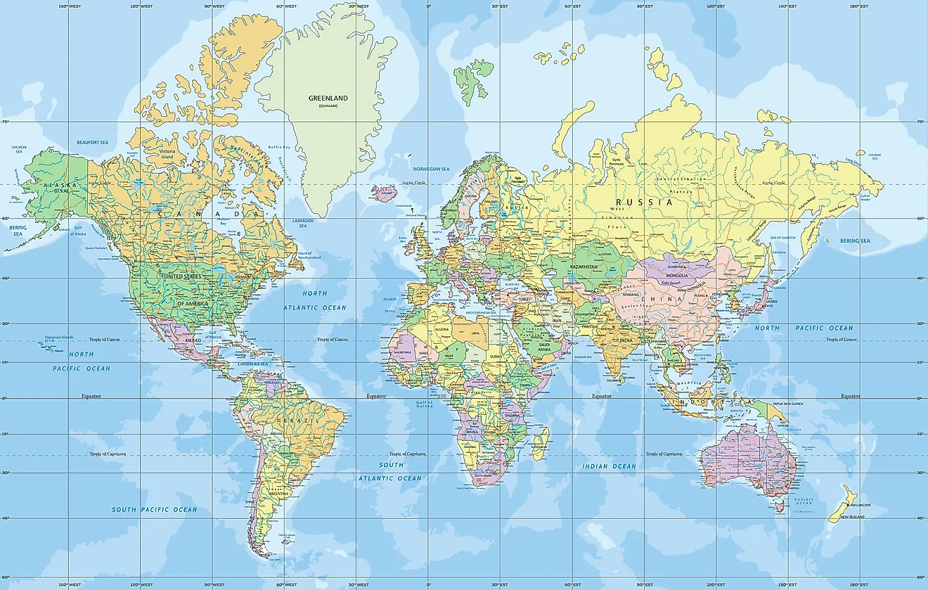
While the Mercator Map excels at preserving angles and making navigation straightforward, its most significant drawback is its severe distortion of area, particularly as one moves away from the Equator. This is the trade-off for maintaining conformality. Landmasses closer to the poles appear disproportionately larger than their actual size, while equatorial regions appear relatively smaller.
The most famous examples of this distortion are striking:
- Greenland vs. Africa: On a Mercator Map, Greenland appears roughly the same size as Africa. In reality, Africa is about 14 times larger than Greenland.
- Alaska vs. Mexico: Alaska often looks comparable in size to Mexico. Mexico is actually much larger.
- Canada vs. Brazil: Canada appears vast, dwarfing Brazil. In reality, Brazil is larger than Canada.
Why Distortion Matters: Perception and Bias
The pervasive use of the Mercator Map, especially in educational settings and as a general-purpose world map, has had a profound impact on how people perceive the relative sizes and importance of different regions. For centuries, this projection was the primary visual representation of the globe, subtly influencing geopolitical and cultural perspectives. Regions in the Northern Hemisphere, particularly Europe and North America, appear much larger and more dominant than they are in reality, potentially reinforcing a Eurocentric view of the world.
This cartographic bias can lead to a misunderstanding of global demographics, resource distribution, and the true scale of developing nations near the Equator. While Mercator's intent was purely navigational, the unintended consequence of his map's widespread adoption was the propagation of a distorted worldview. It highlights how maps, far from being neutral representations, can shape our understanding and even our biases about the world.
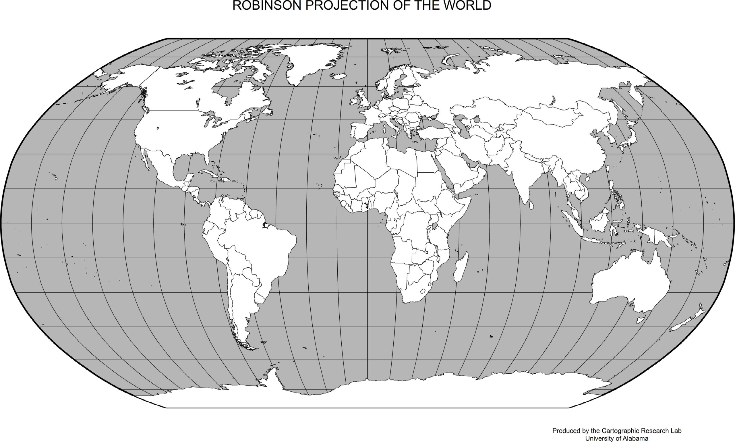
The Equal-Area Alternatives: A Quest for Accuracy
Recognizing the limitations of the Mercator Map for general-purpose mapping, cartographers have developed numerous alternative projections designed to address the area distortion. These "equal-area" projections, such as the Gall-Peters Projection or the Eckert IV Projection, sacrifice the conformality (angle preservation) of Mercator in favor of accurately representing the relative sizes of landmasses. On an equal-area map, Greenland would correctly appear much smaller than Africa, and countries near the Equator would regain their true proportional size.
While these alternatives offer a more accurate representation of land area, they often distort shapes and angles, making them less suitable for navigation. The existence of these different projections underscores a fundamental truth in cartography: no flat map can perfectly represent a sphere without some form of distortion. The choice of projection always involves a trade-off, depending on the specific purpose of the map.
The Mercator Map in the Modern Era: Beyond Navigation
Despite its age and well-documented distortions, the Mercator Projection continues to hold a prominent place in the digital age. Perhaps surprisingly, it is the underlying projection for many popular online mapping services, most notably Google Maps and OpenStreetMap. Why would a projection known for its area distortion be chosen for modern interactive maps?
The primary reason lies in its conformal property. Because the Mercator Projection preserves angles and local shapes, it ensures that features on the map, like buildings, roads, and small landforms, appear visually accurate and recognizable, regardless of zoom level. This is crucial for seamless panning and zooming in digital maps. Imagine if shapes changed drastically as you zoomed in or out; the user experience would be disorienting. Furthermore, the straight grid lines make it computationally efficient for rendering map tiles and calculating coordinates, which is vital for the speed and responsiveness of online mapping applications.
However, the limitations persist. While excellent for navigating city streets or finding local businesses, the Mercator Map's area distortion becomes glaringly obvious when viewing continents or global distances. This has led to ongoing debates and efforts by various mapping platforms to offer alternative views or educate users about the inherent distortions, ensuring that while the Mercator Projection remains useful for its specific applications, it doesn't solely dictate our global understanding.
Beyond the Horizon: The Future of Mapping and Perception
The story of the Mercator Map is a fascinating journey through the history of cartography, demonstrating how a single invention can both solve a critical problem and inadvertently shape global perceptions. From its revolutionary impact on 16th-century navigation to its continued, albeit debated, role in 21st-century digital mapping, the Mercator Projection remains a cornerstone of how we visualize our world.
As technology advances, the future of mapping promises even more dynamic and user-centric experiences. Interactive globes, augmented reality maps, and customizable projections allow individuals to choose the representation that best suits their needs, moving beyond the limitations of any single flat map. The ongoing dialogue about map projections encourages a more critical and informed understanding of cartography, recognizing that every map is a choice, a perspective, and a tool with specific strengths and weaknesses.
Ultimately, the legacy of Gerardus Mercator is not just the map he created, but the enduring conversation it sparked about how we represent and understand our planet. It reminds us that while maps are guides, they are also interpretations, and our perception of the world is constantly evolving.
Conclusion
The Mercator Map, a product of Gerardus Mercator's brilliance in 1569, stands as a testament to human ingenuity in solving complex challenges. Its unique ability to render rhumb lines as straight paths revolutionized maritime navigation, making global exploration and trade vastly more efficient and safer. This conformal cylindrical projection became the undisputed standard for sea charts, dominating the 18th century and beyond, fundamentally shaping our historical understanding of global travel.
Yet, its utility came with a significant trade-off: severe area distortion, particularly at higher latitudes. This distortion, while a necessary consequence of preserving angles, has inadvertently influenced our collective perception of landmass sizes, often leading to misconceptions about the true scale of continents. Despite these visual inaccuracies, the Mercator Map continues to be a foundational element in modern digital mapping, particularly for interactive web applications like Google Maps, where its local shape preservation is highly valued. The ongoing discussion surrounding its use highlights the complex relationship between cartographic utility and accurate global representation. We encourage you to explore different map projections and consider how each one offers a unique lens through which to view our diverse and interconnected world. What are your thoughts on the Mercator Map's enduring influence? Share your perspective in the comments below!

Mercator Projection
World Map - Mercator Projection - WorldAtlas
World Map Mercator Projection Printable | Adams Printable Map
